Exchange-traded funds (ETFs) are a popular financial instrument, offering diversification and flexibility to investors. However, navigating the ETF market to identify trading opportunities can be overwhelming due to the sheer volume of available data. One tool that simplifies this process is the ETF heatmap.
In this article, we’ll explore how an ETF heatmap works, how it can help traders identify opportunities, and how platforms like TradingView provide valuable ETF analysis.
What Is an ETF Heatmap?

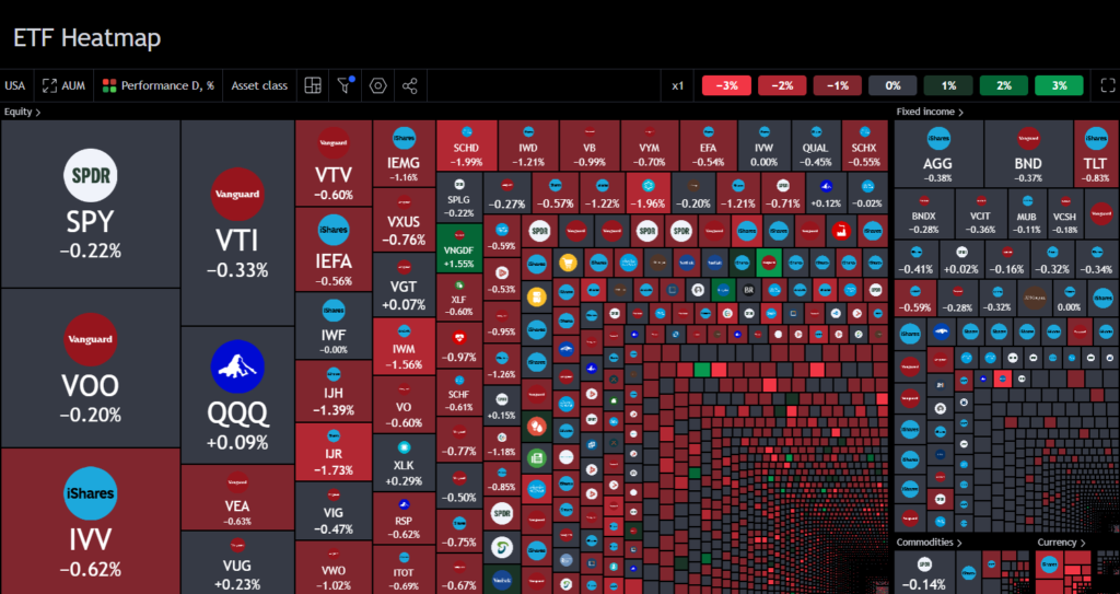
An ETF heatmap is a two-dimensional, color-coded representation of data that helps visualize various factors such as price movement, performance, and trading volume.
The colors in the heatmap represent different values, with warmer colors typically indicating stronger performance or higher trading volumes, while cooler colors may signify weaker performance.
Heatmaps are widely used across many industries for quick data interpretation, from analyzing website user behavior to tracking real estate trends. In ETF trading, a heatmap serves as a powerful tool for traders to quickly assess the market conditions of multiple ETFs at a glance.
Instead of sifting through charts or tables, traders can immediately spot trends and anomalies through the visual color gradients of a heatmap.
Also Read: Key ETF Sectors to Watch With TradingView Heatmap
Understanding ETF Trading Opportunities Through Heatmaps
To effectively trade ETFs, it’s important to recognize patterns in price movements, volume, and performance. This is where an ETF heatmap proves useful, offering traders an intuitive way to interpret large sets of data. By using color-coded information, traders can quickly spot:
- Strong Performers: ETFs that are showing significant gains will usually be represented in warmer colors (reds and oranges), indicating bullish trends.
- Weak Performers: Cooler colors (blues and greens) suggest ETFs that are underperforming, allowing traders to assess whether to avoid or short-sell these assets.
- Sector-Specific Trends: By grouping ETFs by sector, traders can see which industries are performing well and which are lagging behind. For example, if most ETFs in the technology sector are shaded in warm colors, it may signal an upward trend in that sector, highlighting a potential opportunity for traders.
By providing a bird’s-eye view of the ETF market, a heatmap can reveal trading opportunities that might otherwise be missed when using traditional data analysis tools.
Read More: Identifying Top ETFs with TradingView ETF Heatmap
How ETF Heatmaps Work
ETF heatmaps work by aggregating and visually representing data points across a grid. Each cell in the heatmap corresponds to a specific ETF, with its color representing a key performance indicator such as price change, volume, or return over a given time frame.
Color Coding:
- Warm colors (red, orange, and yellow) often represent ETFs with positive price movements, indicating buying interest.
- Cool colors (green, blue, and purple) represent negative movements or underperformance, signaling potential selling opportunities.
Interpreting Data:
- High Performance: If an ETF shows a consistent upward movement in a heatmap, it’s marked in a warm color, indicating that the ETF is outperforming others in its sector or market.
- Low Performance: ETFs with minimal or negative movements are marked with cooler shades, alerting traders that these may not be favorable assets for immediate investment.
Time-Based Analysis:
- Heatmaps are dynamic and can show real-time or historical data. Traders can compare today’s ETF performance with data from the past to detect emerging trends.
By offering such quick, digestible insights, ETF heatmaps empower traders to make faster, more informed decisions.
Benefits of Using ETF Heatmaps
The main advantage of using an ETF heatmap is its ability to simplify complex data sets, making them easier to interpret. Here are some key benefits:
- Quick Data Visualization: Heatmaps allow traders to see large amounts of data in a single view. Instead of analyzing multiple charts or tables, traders can quickly identify opportunities and potential risks by simply glancing at the color-coded map.
- Identifying Patterns and Trends: ETF heatmaps enable traders to spot patterns, such as sector-wide rallies or sell-offs. This can help traders position themselves ahead of market moves, whether by entering trades or protecting their portfolios from risk.
- Comparing Multiple ETFs: Heatmaps allow traders to compare the performance of various ETFs across different sectors, industries, or markets. For instance, a heatmap may reveal that technology ETFs are outperforming energy ETFs, guiding traders toward sectors with better opportunities.
- Enhanced Decision Making: By providing a clear visual representation of market conditions, heatmaps enhance decision-making by making it easier to spot opportunities that align with a trader’s strategy.
Also Read: Best Ways to Use ETF Heatmap For Portfolio Diversification
Using TradingView for ETF Analysis
TradingView is a popular platform for ETF analysis, offering real-time data, customizable charts, and a comprehensive ETF heatmap feature. By using TradingView’s ETF heatmap, traders can gain insights into the performance of different ETFs across various sectors and markets.
- Real-Time Data: TradingView provides live updates, allowing traders to react quickly to market changes.
- Customization: Users can customize their heatmap based on specific timeframes, indicators, or sectors. This flexibility is crucial for tailoring the heatmap to match individual trading strategies.
- Integration with Technical Analysis Tools: TradingView’s ETF heatmap can be integrated with other analysis tools on the platform, such as price charts and trend indicators, to provide a holistic view of the market.
By leveraging TradingView’s features, traders can combine heatmap insights with other forms of technical analysis to make more informed trading decisions.
Spotting ETF Trading Opportunities with Heatmaps
So, how exactly can traders use ETF heatmaps to spot trading opportunities? Here are a few key strategies:
- Identifying Momentum: ETFs that show consistent upward momentum, indicated by warm colors, are often a sign of strong investor interest. Traders can capitalize on these trends by entering trades during bullish periods.
- Detecting Overbought or Oversold Conditions: Heatmaps can help traders spot ETFs that are overbought or oversold based on sudden shifts in color. This could signal an upcoming reversal, allowing traders to act accordingly.
- Sector Rotation: By using heatmaps to track sector performance, traders can identify when capital is flowing into or out of certain sectors. For example, if technology ETFs are heating up while healthcare ETFs cool down, traders can adjust their positions to capitalize on these shifts.
- Volume Analysis: Heatmaps that incorporate trading volume can highlight ETFs with significant buying or selling pressure, providing clues about future price movements.
Also Read: How Can ETF Heatmap Help You Visualize ETF Market Trends?
Conclusion
ETF heatmaps are an essential tool for spotting trading opportunities. By simplifying complex data into an intuitive color-coded visual, heatmaps make it easier for traders to identify trends, compare ETF performance, and make informed decisions.
Platforms like TradingView further enhance this experience by offering real-time, customizable heatmap analysis. For any trader looking to gain a competitive edge in the ETF market, mastering the use of ETF heatmaps is a must.


