Comparing exchange-traded funds (ETFs) effectively is essential for building a balanced portfolio. One of the best tools available for ETF comparison is TradingView’s ETF Heatmap. This powerful tool enables investors to visualize ETF performance, identify trends, and assess risks at a glance.
This article provides a step-by-step guide on how to use the ETF heatmap for ETF comparison and portfolio diversification.
Understanding the Basics of ETF Comparison
Before diving into the specific features of TradingView ETF heatmap comparison, it’s important to understand why ETF comparison is valuable. With thousands of ETFs in the market, each tracking different sectors, asset classes, or geographic regions, selecting the right ETF requires careful analysis. Investors need to compare several factors like:
- Performance over time
- Risk metrics
- Expense ratios
- Sector exposure
- Asset allocation
These elements help investors identify ETFs that align with their financial goals and risk tolerance. Comparing ETFs simplifies the selection process and ensures that the chosen fund fits your strategy.
What Is an ETF Heatmap?

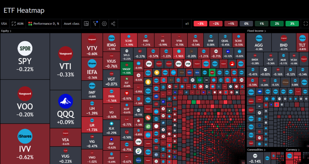
An ETF heatmap is a visual representation of ETF data that allows investors to quickly analyze trends, performance, and other relevant statistics. The heatmap displays ETFs in a grid format, with colors representing performance metrics like returns, volatility, or volume.
By using a heatmap, investors can easily see which ETFs are performing well and which are underperforming. This tool is invaluable for spotting investment opportunities and monitoring market trends, making it an essential feature for effective ETF comparison.
Also Read: Spotting ETF Trading Opportunities with Heatmap
Step-by-Step Guide to Comparing ETFs Using TradingView’s ETF Heatmap
Here are the step-by-step guide to comparing ETFs using TradingView’s ETF Heatmap:
Step 1: Accessing the ETF Heatmap on TradingView
To begin your ETF comparison, start by accessing the ETF Heatmap feature on TradingView. Navigate to the ETF screener section of the platform, where you can select the ETFs you’d like to compare. TradingView offers an intuitive interface, making it easy to filter and search for specific ETFs.
Step 2: Selecting ETFs for Comparison
In the ETF screener, you can choose the ETFs you want to compare by selecting individual tickers. Look for the “Compare” button in the ETF profile to add an ETF to your comparison basket. You can select multiple ETFs based on asset class, sector, or performance criteria.
As you continue browsing through different funds, you can add or remove ETFs from your comparison basket. This flexibility allows you to compare a wide range of ETFs and refine your selection based on your investment strategy.
Step 3: Customizing Your ETF Comparison Criteria
One of the advantages of TradingView’s ETF Heatmap is its customization features. Once you’ve selected the ETFs for comparison, you can choose specific criteria such as:
- Performance: Compare ETFs over various time frames (e.g., 1 year, 5 years, or by calendar year).
- Risk: View metrics such as volatility, beta, and risk-adjusted returns.
- Expense ratios: Check management fees, a key factor in long-term investment returns.
- Sector exposure: Examine the underlying sectors in which the ETF invests, such as technology, healthcare, or financials.
Customizing these criteria helps you tailor the comparison to your specific needs, providing deeper insights into how each ETF performs relative to your goals.
Step 4: Visualizing Performance with the ETF Heatmap
Once you’ve chosen your ETFs and customized your comparison criteria, you can view the performance data in the form of a heatmap. The heatmap visually displays each ETF’s performance, with colors indicating returns over different periods.
For example, ETFs with strong recent performance might be highlighted in green, while those that have underperformed are shown in red. This color-coding makes it easy to spot trends and determine which ETFs are currently performing well or under pressure.
Also Read: Key ETF Sectors to Watch With Heatmap
Key Features of TradingView’s ETF Heatmap for Comparison
Here are some of the key feature which can help you for ETFs Comparison:
Performance Tracking
TradingView’s ETF Heatmap allows you to compare ETF performance over multiple time frames, including weekly, monthly, and annual returns. The “Periods” tab shows performance by date range, while the “Years” tab displays annual performance. By analyzing this data, you can determine which ETFs have consistently performed well and which ones are more volatile.
Risk Metrics
Risk is an important consideration in ETF comparison. The heatmap provides access to volatility metrics, showing how much an ETF’s returns deviate from the average. Investors can use this information to assess the risk associated with different ETFs and make informed decisions.
Graphical Comparison Tools
In addition to the heatmap, TradingView provides graphical tools for ETF comparison. You can visualize performance data using both line charts and bar charts. Line charts are useful for tracking long-term trends, while bar charts provide a clear snapshot of how ETFs have performed relative to each other over shorter periods.
Tabular Comparisons
For a more detailed analysis, TradingView’s ETF heatmap also includes tabular comparisons. This format allows investors to compare ETFs based on performance, risk, and expense ratios side by side. This table-based comparison is especially useful for reviewing multiple ETFs at once and making quick decisions.
Interactive Risk Cloud
For more advanced users, the interactive risk cloud feature allows you to visualize risk levels across various ETFs. This is particularly helpful for investors seeking to balance risk and reward when diversifying their portfolios. The heatmap includes a monthly return comparison, showing how each ETF has performed on a month-by-month basis.
Conclusion: Using the ETF Heatmap to Optimize Your Portfolio
TradingView’s ETF Heatmap is an indispensable tool for investors looking to compare different ETFs and make data-driven decisions. By offering a clear visualization of ETF performance, risk, and expense ratios, the heatmap simplifies the ETF selection process and helps investors build diversified portfolios.
Whether you’re looking to optimize your portfolio or identify new investment opportunities, TradingView’s ETF Heatmap comparison feature provides valuable insights that can improve your investment strategy. Use it to analyze various ETFs based on your criteria, and make more informed choices for long-term success.


