Stock heatmaps are one of the most powerful visual tools available for traders and investors seeking to compare the performance of major indices.
These heatmaps provide a color-coded representation of stock performance across various timeframes and indices, making it easier to interpret complex market data at a glance. In today’s fast-paced financial world, tools like the stock heatmap have become indispensable for comparing major indices like the S&P 500, Nasdaq, Dow Jones, and others.
In this article, we’ll explore how to effectively use a stock heatmap to compare major indices, examine its benefits, and delve into tools like TradingView that help with market performance analysis.
What is a Stock Heatmap?

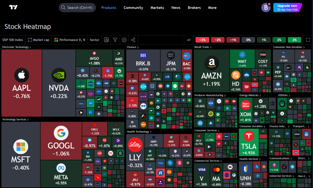
A stock heatmap is a visual tool that displays the performance of stocks or indices through color-coded tiles. Typically, green represents positive movement, while red indicates negative movement. The intensity of the color often reflects the degree of change, making it easier to identify significant market trends at a glance.
Each tile on the heatmap represents an individual stock or index, with the size of the tile corresponding to its market capitalization or another relevant factor. The larger the tile, the more influential that stock or index is in the overall market performance.
Also Read: Analyse Stock Market With TradingView Stock Heatmap
Visual Comparison of Major Indices
One of the greatest advantages of using a stock heatmap is the ability to visually compare the performance of multiple major indices. For instance, tools like TradingView allow users to add indices such as the S&P 500, Nasdaq, Dow Jones, FTSE, and others to a single heatmap for side-by-side comparison.
By color-coding the performance of each index, a stock heatmap enables users to quickly see which indices are performing well and which are lagging. This feature is especially useful for those who trade across multiple markets and need to stay informed on global market trends.
Example:
Imagine comparing the S&P 500 to the Nasdaq on a single heatmap. If the S&P 500 is predominantly green while the Nasdaq shows more red tiles, it immediately tells you that the S&P is outperforming the Nasdaq on that specific day. This quick visual snapshot saves time and eliminates the need to analyze numerous individual charts.
Also Read: Spot Trading Opportunities with Stock Heatmaps: Tips & Strategies
Multiple Indices at Once
Another valuable feature of stock heatmaps is the ability to display multiple indices simultaneously. This is especially helpful when monitoring several indices across different regions, such as the S&P 500 in the United States, the FTSE 100 in the UK, and the Nikkei 225 in Japan. With a single glance at the heatmap, you can gauge the performance of these indices in real-time.
Platforms like TradingView provide options to create custom heatmaps that track the performance of a wide range of indices. Whether you want to compare indices from different countries or sectors, these tools offer the flexibility to customize your view based on your needs.
Timeframe Flexibility
A stock heatmap offers more than just real-time performance tracking. Users can adjust the timeframe to analyze stock performance across different periods—whether daily, weekly, monthly, or even longer intervals. For example, if you’re interested in long-term trends, you can set the heatmap to display stock performance over a six-month or one-year period.
This flexibility in timeframes makes heatmaps versatile for both short-term traders and long-term investors. Day traders can focus on intraday movements, while long-term investors can examine broader market trends over extended periods.
Identifying Market Trends and Opportunities
One of the most practical uses of stock heatmaps is identifying market trends. By examining the overall color patterns on the heatmap, you can quickly spot which sectors or indices are performing well and which are underperforming. This insight allows investors to capitalize on emerging trends or avoid potential downturns.
For example, during a market-wide rally, you may notice that most indices display a strong green color. This suggests a bullish sentiment across multiple markets, prompting you to consider investing in sectors that are outperforming. Conversely, if the heatmap is dominated by red tiles, it could be a signal to adopt a more defensive strategy.
Using TradingView for Market Performance Comparison
TradingView is one of the most popular platforms for creating and analyzing stock heatmaps. It offers a comprehensive suite of tools that allows traders to compare the relative performance of stocks and indices across different timeframes. By using the TradingView heatmap feature, you can visually assess market performance and track trends over time.
Key Features of TradingView Heatmaps:
- Customizable Indices: Users can select multiple indices to display on the same heatmap, making it easy to compare global stock performance.
- Timeframe Adjustments: Traders can choose daily, weekly, or monthly timeframes to view market trends.
- User-Friendly Interface: The platform is intuitive, allowing traders to quickly set up and interpret heatmaps for real-time analysis.
Also Read: Key Sectors to Watch Using TradingView Stock Heatmap
How to Use Stock Heatmap on TradingView
To use a stock heatmap on TradingView, follow these steps:
- Open TradingView: Go to the TradingView platform and search for the stock heatmap tool.
- Select Indices: Choose the indices you want to compare (e.g., S&P 500, Nasdaq, Dow Jones).
- Set Timeframe: Adjust the timeframe to match your analysis period (e.g., daily, weekly).
- Analyze the Heatmap: Once the heatmap is set, review the color-coded performance of each index. Look for trends such as bullish or bearish momentum in the market.
This quick setup allows you to monitor stock performance across multiple indices, helping you make informed decisions about your investments.
Benefits of Stock Heatmaps for Investors
There are numerous benefits to using stock heatmaps to compare major indices:
- Easy Visualization: Heatmaps offer a clear and simple way to view stock performance across various indices, making complex data more accessible.
- Trend Identification: Investors can quickly identify which indices are gaining or losing momentum, helping them make timely investment decisions.
- Cross-Market Comparison: Heatmaps allow users to compare indices across different regions and sectors, providing a global perspective on market trends.
- Customizable Timeframes: Investors can analyze performance over any desired period, from short-term intraday trends to long-term market movements.
Also Read: How Does Stock Heatmap Help Identify Market Leaders and Laggards?
Conclusion
A stock heatmap is an invaluable tool for anyone looking to compare the performance of major indices. By providing a visual representation of stock movements, heatmaps make it easier to interpret market data and identify trends.
Tools like TradingView enhance this experience, offering customizable options for comparing indices across multiple timeframes. Whether you’re a short-term trader or a long-term investor, using stock heatmaps can help you stay informed and make better financial decisions.
Incorporating heatmaps into your trading or investment strategy is a smart way to stay ahead of market trends and gain insights into stock performance across various indices. By leveraging platforms like TradingView, you can maximize the potential of stock heatmaps for comparing major indices and ultimately improve your market analysis.


